The power of Workday is truly unlocked when you have a partner in your corner who can empower users to make informed, data-driven decisions. Invisors knows that one of the best ways to help our customers achieve this is by creating Workday dashboards that organize + simplify your data and provide a hub for information to access key functions and high-priority items with ease. Here are some of our favorite Workday dashboards we offer to enable your team to make smarter decisions around your everyday essential business processes:
The Audit Dashboard
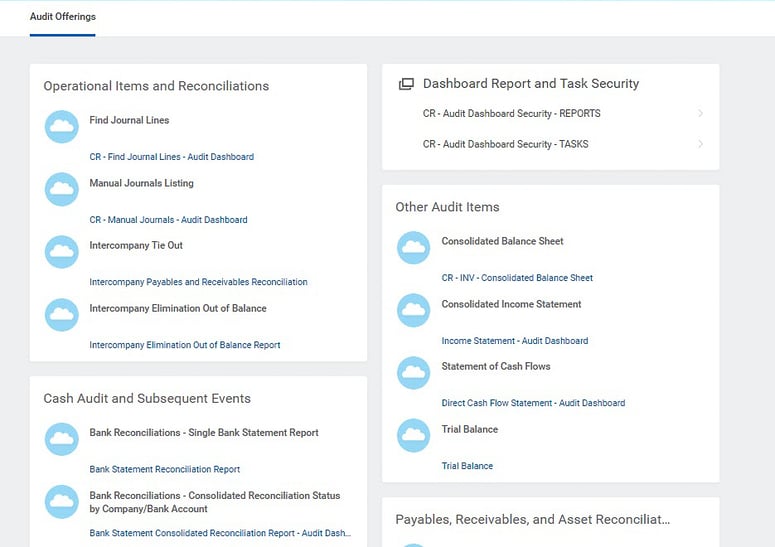
In a nutshell: The Audit dashboard collects report links for common audit data requests and displays them in a logical order, making it easy for an internal accounting manager or external auditor to jump in + pull the information they need from Workday.
Why we ❤️ this dashboard
Audit requests tend to span all financial areas; say goodbye to asking end users from every department to extract + send data to the audit team! With Invisors’ Audit Dashboard, one person can complete this task with a single Workday dashboard visit. This dashboard is designed for use by the Finance Auditor role and organizes report links by the following audit areas:
- Operational Items + Reconciliations
- Payables + Receivables + Asset Reconciliations
- Payroll + Cash + Subsequent Events
- Tax
While the Workday dashboard itself provides a set of standard reports, our offering includes discovery time – an opportunity to meet with your team + end users to decide if you need to replace your standard reports with preferred custom ones, drop unrelated reports, add new sections based on your audit cadence, and reorganize your groupings. With your feedback + Invisors’ support, we'll ensure that this dashboard is a one-stop shop for your Provided by Client (PBC) and request list.
Estimated Hours for Implementation + Optimization: 20-35 hours
 Invisors Audit Dashboard
The Data + Operations Management Dashboard
In a nutshell: This Workday dashboard displays a high-level assessment of the tenant’s health by combining Workday Delivered + Invisors-built audits around business process performance and data quality.
Why we ❤️ this dashboard
The Data + Operations Management dashboard enables you to understand what’s happening in your tenant daily, weekly, and monthly to assess where your processes may be inefficient or contributing to data quality issues. You can access the details needed to:
- Push forward held-up processes
- Resolve gaps or inconsistencies in worker data
- Use high-level trends to determine why issues are occurring
During implementation, we use this dashboard to validate that the data conversion meets your business requirements + addresses outstanding issues.
This Workday dashboard uses custom Process + Data Quality Indicators built based on our team’s experience and your business requirements to ensure there are no gaps or inconsistencies in your data that affect integrations, business processes, payroll, budgeting + planning, or your ability to report on business trends.
Estimated Hours for Implementation + Optimization: 20-35 hours
-png.png) Invisors Data + Operations Management Dashboard
Invisors Data + Operations Management Dashboard
The Integrations Management Dashboard
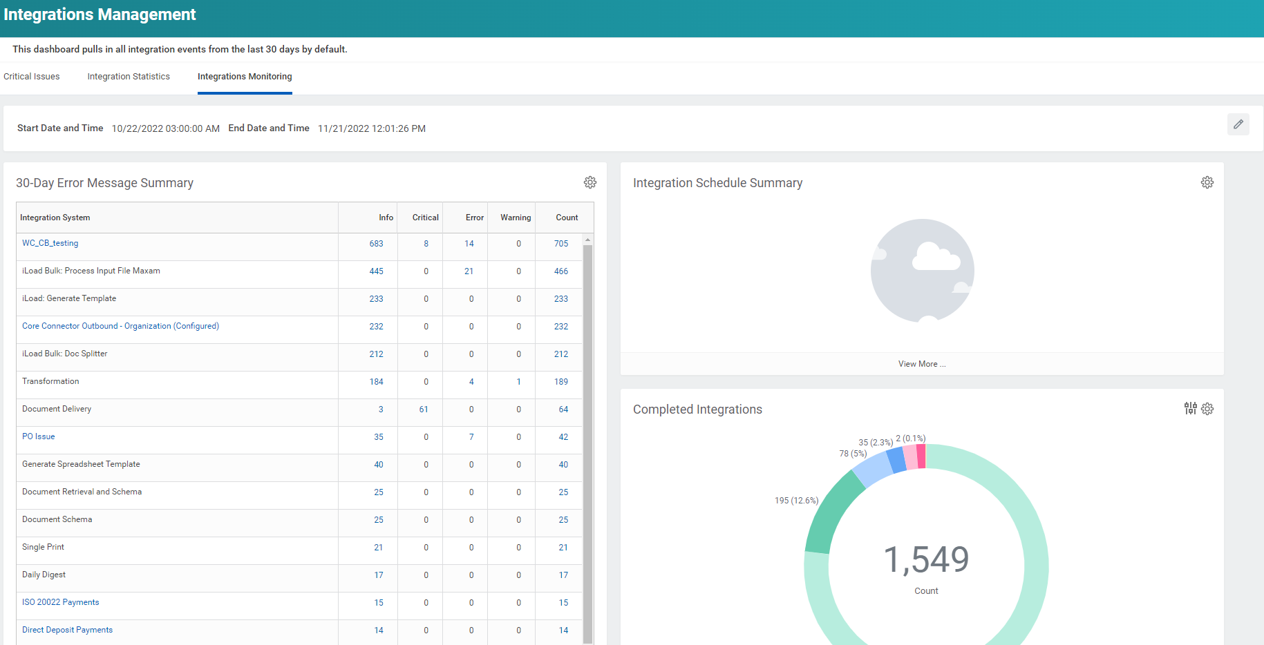
In a nutshell: The Integrations Management dashboard is a one-stop shop for Integration Administrators to keep a pulse on the overall health of the customer’s Workday integrations. With our custom-built reports that pull the most important data of your integrations, you’ll have a bird’s-eye-view with access to manage issues with your integrations as they arise. Through proactive monitoring, you can proactively address most functional issues that manifest as Integration errors.
Why we❤️ this dashboard
This Workday dashboard helps our customers gain confidence in the Integrations workstream and empowers them to troubleshoot reported integration errors + understand a workstream that is often misunderstood.
Tab 1: Critical Issues is where Integrations Administrators are kept up to date with the most prominent issues relating to security and integrations. This includes upcoming expiration dates on security items, failed ISU sign-ons that may indicate password expiry + potential security risks, and critical errors in the last 24 hours.
Tab 2: Integration Statistics enables Integration Administrators to identify and resolve the most troublesome + problematic integrations. Don’t dig through data- this tab provides detailed insight into the data of integration errors, so you can get straight to resolving these problem areas.
Tab 3: Integration Monitoring transforms the efficiency of this workstream. This tab offers a visual analysis of scheduling + integration issues, giving Integration Administrators an overview of key activities. Visually appealing reports allow you to keep your eyes on what’s important + address integration issues promptly.
To enhance this process + ensure a smooth implementation, we recommend pairing the dashboard with the Invisors Integrations Inventory + Monitoring Service. This will help Integration Administrators find integration issues more proactively, provide initial triage and troubleshooting guidance, and offer long-term resolutions.
Estimated Hours for Implementation + Optimization: 10 hours
 Invisors Integrations Management Dashboard
With these Workday dashboards in your toolbox, you unlock the ability to make efficient, data-driven decisions in some of the key areas of your daily business.
Have an area where you’d like to optimize your analytics capabilities that we didn’t touch on above? Our Workday experts have dashboards that span every corner of the Workday system. Contact us today to discuss unlocking new data insights within Workday.
Contact a Workday expert
.png)


